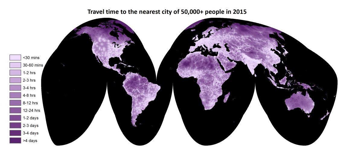
 A global map of travel time to cities to assess inequalities in accessibility in 2015. Nature vol 553, p333-336.")
The full name of the map, which stirred up a lot of interest worldwide, is ‘A global map of travel time to cities to assess inequalities in accessibility in 2015’. In a nutshell, it shows how long it takes to get to the nearest city from anywhere on Earth. ‘Cities are hubs for economic and social activities. They offer a high concentration of markets, jobs and facilities for healthcare or education,’ explains Nelson. ‘The map reveals how easy it is for people in different areas to access these resources - and that many people, especially in developing countries, often have to spend long hours to meet their basic needs.’
Collaboration with Google
The map is a result of a collaboration between various experts from the University of Oxford, the European Commission’s Joint Research Centre (JRC), Vizzuality, the University of Washington, the University of Queensland, Imperial College, the University of Twente and, last but not least, Google which provided large data sets and the processing tools that made the map possible.
It all started with the ITC professor, though. In 2008, Andy Nelson was working at JRC and was asked by the World Bank to calculate the number of people who lived within one hour travel time of a city. He accepted the project and ran with it. ‘I didn’t stop at one hour from a city, I kept going and ended up with a global map, which received a lot of attention. It was a completely new visualization of how connected we are,’ says Nelson, whose original method was used to generate the new (and much more detailed) map. ‘We used the same method, but improved the quality of the map thanks to big advances in the available information and means, which we had at our disposal thanks to the collaboration with Google.’

Where do we go and how long does it take?
How does it all work? ‘To make the map, you need several layers of spatial information that cover the entire world,’ Nelson begins to describe the method. ‘Firstly, you need to know where people want to travel to. In this case, that means all cities with more than 50,000 inhabitants, because we can assume that such cities have all necessary facilities that people need access to, including hospitals, schools, food markets etc. Secondly, you need to know how long it takes to get there. For that you need data on transport networks and the typical speeds of travel over those networks, and for foot-based speeds you need to know the slope and type of land - is the area covered by forest, grassland or desert? Once you have that information, you can estimate how long it takes to cross one kilometer of the land.’
A special algorithm was used to calculate the shortest route from anywhere to the nearest city. This approach is very computationally expensive, though, and so this is where Google came into play. The researchers used a newly implemented version of the algorithm on Google Earth Engine (a cloud computing platform for global scale analysis), which allowed them to quickly process very large sets of data. On top of that, Google provided a new road data set, which the researchers combined with the roads from Open Street Map to make the most detailed and up to date representation of the world’s land-based transport networks. This made the production of the map much faster and easier than it was ten years ago.
‘People are left behind’
The global map is now completed and publicly accessible. The current map is a generic representation of our world in 2015, but Professor Nelson stresses that it can easily be updated or used for creating more detailed maps of smaller areas. ‘We chose to generate a map of 2015, because that was the starting year of the UN’s Sustainable Development Goals, which carry the theme “leave no one behind”. This map shows that people are left behind.’
'This map shows that people are left behind'
Knowing how accessible a place is can be very useful for researchers, policy makers or investors. ‘Accessibility is an important factor in many domains: healthcare, food security, deforestation and so on. For instance, if you have bad access to health services, child mortality is likely to be higher or vaccination rates lower. Access to market influences the availability, quality and price of food. Not to mention that the time you spend travelling could otherwise be spent on something more productive, like work or education,’ says Nelson.
'The solution isn't to build more roads'
Based on the map, which parts of the world seem to have the biggest problems with accessibility? ‘Well, on one hand, you could say “Not the Netherlands!” since everything is well connected and even small towns provide good access to many services people need, even accounting for the traffic jams! On the other hand, the concept of “remote” doesn't really apply in this country, and that may make it hard to maintain the isolated and peaceful character of some rural and natural areas which also have a high value,’ answers Nelson.
A striking example of the problem of too much access is Indonesia where road building has opened up previously remote areas which have then suffered from higher rates of deforestation. Sub-Saharan Africa provides examples where too little access is the problem. ‘We looked at large household survey data in developing countries and saw that poor access to cities was associated with lower wealth, lower rates of education and poorer health outcomes, compared to households with better access,’ clarifies the UT researcher.
With these examples, we start to see the two sides of accessibility. So, how can access to basic economic and social needs be improved while maintaining and even improving the natural environment? The map could be used to help answer this question. ‘The solution isn't to build more roads,’ stresses Nelson. ‘The world is already a well-connected place. The map can guide where improvements to the transport network would provide the most benefits with the least impacts and it can show where road construction should be avoided.’
You can also find this article in the most recent issue of our Science & Technology Magazine. Get a printed copy at the campus or view the magazine online.