
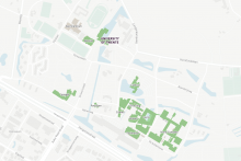
The digital map displays the whole University of Twente campus. The colours red, orange and green indicate how busy each building is – in relation to the 1.5 meter capacity of the specific building. ‘The map should serve as a support tool,’ says Laurens van der Velde from the UT corona crisis team. ‘It can help people decide where it’s suitable to go for lunch, for example. However, even if the building is marked ‘red’, it doesn’t mean they cannot enter. It is up to everyone to decide.’
The buildings’ occupancy is measured by the number of devices connected to the local Wi-Fi networks. ‘We were very careful to protect everyone’s privacy,’ says Van der Velde. ‘We only measure the number of devices, not what type of devices they are or who they belong to. No personal information is stored. Because of this, we don’t get the exact number of occupants, but the map offers a very decent estimate.’
The map has been in the making for a while, explains Van der Velde. ‘As part of the Living Smart Campus project, we have been exploring how to use data to improve our daily lives. This included using data to measure how busy the campus is – which is a good tool for the current situation. LISA, in collaboration with CFM, improved the Beta version and launched the version that is online now.’
The CampusCrowdMap shows information per building, but will soon include even more detailed numbers on occupancy per floor. It is now only accessible through a web browser, but the possibility of becoming a mobile app is open, says Van der Velde. ‘This is just the first step to introduce the map to the UT community. It offers many interesting possibilities.’