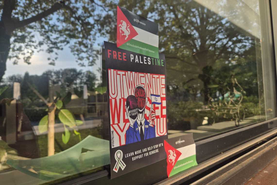
The official opening of the academic year marked the launch of the university's new homepage. This homepage features an improved layout. Organized by target group and theme, the information is more accessible. Target groups may be potential students, employees, students, press, alumni, corporations and visitors. Examples of themes include faculties, services and administration.
If you visited the website since Monday you will have seen the differences: no more blue, but a green, well-organized and sleek design. 'The previous UT-site, especially the structure of its information, was no longer up to standards. The life of a website design is only two years; this one was long ago considered to be dated. The new design was created by Axis, a multimedia company in Enschede, in cooperation with the Center for Information Services (CIV) and the Dinkel Institute,'explained Jan Volbers, Manager of Communication Services, adding 'The new UT site no longer uses frames.'
This yearlong project includes the English website, which is accessible from the UT homepage by clicking on 'English'. When the system is completely in place - which will still take a few weeks - all faculties and departments will be available in both Dutch and English. The great challenge for Suzanne van der Kolk and Frank H÷ppener of the International Office was coordinating all of the University departments to create consistent and unified content which could then function as an online study and information guide. Unlike the former website, each faculty and department is now responsible for providing a university-wide agreed upon minimum of information about its respective study programs and services.
Volbers's test was to create 'a lean and mean modern design that looks great.' Has he succeeded? Look for yourself at http://www.utwente.nl.